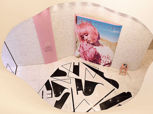
To commemorate the publication of the Summer Issue for the seasonal edition of the corporate culture magazine Hanatsubaki, the "pink pop! A New Hanatsubaki" exhibition is now on at the GINZA COMMUNICATION SPACE at the Shiseido Ginza Building (3 April - 30 June 2017). I understand that this project was planned in association with the magazine itself.
Kishino: Yes. To begin with, this can be traced back to the origins of the special feature in the Summer Issue of Hanatsubaki, titled "pink pop!" As "pink" color gets attention especially from the youths today, the editorial team of Hanatsubaki has attempted to analyze and understand this generation through the special feature placing its focus on this color. Against that background, discussions started up within the company on the idea of organizing a project linked with the Hanatsubaki magazine. As a result, the decision was made to hold an exhibition based on the motif of "pink," as we did for the magazine.
So, this exhibition is the result of communication and collaboration between the editorial team of Hanatsubaki and the Shiseido Advertising and Design Department.
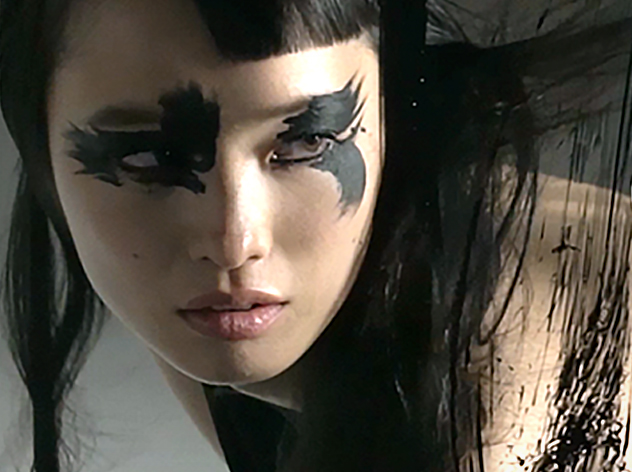
Kishino: That's right. Together with the Art Director of Hanatsubaki, Katsuhiko Shibuya, we talked about how pink is a more diverse color than it was a long time ago, and suggested that it has also become a gentler color tone. There is a giant replica of the Hanatsubaki magazine at the entrance to the exhibition, and the pink hair that was photographed for the cover of this replica is a gentle tone that avoids being overly harsh.
Pink is a more diverse color than it was a long time ago.
Looking at the reverse side of each card, I see that they contain stories and descriptions of the origins of the names. They offer an enjoyment reminiscent of tarot cards. What was the inspiration behind the creation of these cards?
Kishino: I took reference from the book Kara & Imeji: Iro no Shojiten ("COLORS in Context") (out of print) authored by Naomi Kuno, whom I had met more than 10 years ago. I obtained her permission to use this small dictionary as a reference. The book provides explanations to all the colors one by one, but differs from the "reference books" that present colors through coded numbers and academic information. Rather, the texts used to describe the colors are all emotional, and simply reading them takes me into a dream world. It is a book that I really love.
30 variations of pink inspired by a dictionary of colors
The various objects in the window display, such as the vases and tableware, are marked respectively with numbers, alongside with the message "Think Pink, Feel Pink." When you enter the display area, you will find that 30 variations of pink cards have been placed there. One of the features of this exhibition is that visitors can bring home with them the cards describing the colors used in the exhibition space.
Kishino: I really hope that everyone will be able to find the card for their favorite color and bring it home. Some cards are so surprisingly colored that they make you puzzled, like "What? Is this pink?" Other cards also carry unusual names that you would never think of using to describe a color, such as "mama." I am sure the visitors would make many interesting discoveries.
Looking at the reverse side of each card, I see that they contain stories and descriptions of the origins of the names. They offer an enjoyment reminiscent of tarot cards. What was the inspiration behind the creation of these cards?
Kishino: I took reference from the book Kara & Imeji: Iro no Shojiten ( "COLORS in Context") (out of print) authored by Naomi Kuno, whom I had met more than 10 years ago. I obtained her permission to use this small dictionary as a reference. The book provides explanations to all the colors one by one, but differs from the "reference books" that present colors through coded numbers and academic information. Rather, the texts used to describe the colors are all emotional, and simply reading them takes me into a dream world. It is a book that I really love.
The power of pink to attract people
What feelings would you like the visitors to take with them after viewing the "pink pop! A New Hanatsubaki" exhibition?
Kishino: I hope that they will walk away thinking "Pink is a great color after all." Colors and objects carry various meanings, so I also hope that they will gain an understanding of that, and feel emotionally and spiritually enriched by that. In truth, the time taken from the conception to the completion of this exhibition was very short, only about 1.5 months. Nevertheless, the appeal of the color pink has been a driving force for all members of the staff, and I feel that it has brought us closer together in unity.
In the future, are there plans to continue organizing exhibitions in association with Hanatsubaki?
Kishino: There are no concrete plans yet, but I definitely hope that we will. Through the exhibitions that I produce, I believe it will be fun to approach textures, scents, and physical elements that cannot be communicated only through media formats such as paper and the Internet. I place great value on the "power of the space" precisely because we live in a world with values that are becoming increasingly diversified. the day may come when deep meaning emerges from the values and other things that can be shared only among those who visit the space.